Best UX Design Trends 2018
The goal of good UX design is to drive ease of use and improve customer satisfaction when they interact with your product. To understand the term UX, you should know what bad UX is.
Suppose you have created a website or an app and your target Mr. ‘X’ is finding it difficult to use your product. Then it is seen you have failed in providing a good experience to the product users. Now that’s all about UX. If you want to learn more about UX, then go through the post mentioned below.
Related: UI Vs UX: the Growing Importance to Know the Difference
Through UX designing you will determine the kind of experience users are going to have while using your website or application.
In this post, we will learn about biggest UX design trends that should be implemented in 2018.
For many years we have seen design trends taking a corner or dying a quiet death and of course, it’s a very rare sight to witness any one of them through decades. 2017 had been a smart year. We saw the rise of machine learning, voice search, artificial intelligence and much more.
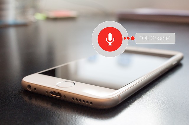
1. Voice UI
A new form of human-computer or let’s say human-device interaction has emerged.
Voice UI.
The popularity of UI doesn’t seem to die down any soon. People have greatly embraced the technology, so it’s definitely a good time you follow the crowd through voice interaction UX.
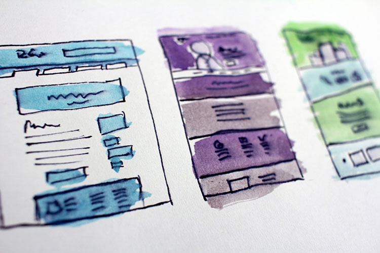
The transition can be little challenging if you are coming straight from GUI designs. For the reason, we know there are no wireframes for voice. Once you succeed in creating a prototype for voice, nothing will be outside the scope for you as a UX designer.
There are a lot of things you have to keep in mind if you are designing conversational interface.
- You have to take advantage of contraction in prompts – we tend to contract words while speaking, so, keep this in mind.
- Interpret the difference between how we speak and how we write.
- Understand that speech is not based on flow-charts but happens over context.
- Make sure to document sample dialogues and user-stories.
2. The Rise of Video Content
The digital revolution is on and still, if you are using static graphics to promote your service and products, it’s not acceptable.
To make people appreciate your brand, give them a 360 view of the product through an HD video and make your website more enjoyable for people. Incorporating stories in your design, people will be compelled to associate more. Engaging them can be a real deal for your website conversion rates.
If you visit the website Spotify, you’ll relax and enjoy every moment you spend on the website as the full-page background video gives you fun and freedom at the same time.
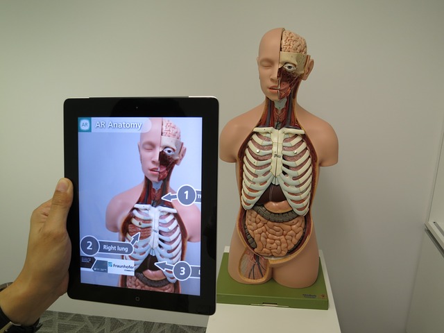
What exactly happens in Augmented Reality?
I’ll be explaining with reference to above picture.
You’ll see superimposition of computer-generated information over products when viewed through a sensor-packed wearable device. The benefits are very simple. Customers will connect better with your products. Better they understand; higher will be the chance they convert.
Interaction design can be a game-changer for brands. Irrespective of what you sell or how big your business is, AR will help you in a big. Pokemon Go was a huge success with a week of its launching, the reason is AR. We cannot even forget Snapchat’s most popular face-swapping feature or Microsoft’s HoloLens, where users are allowed to apply diagrams or graphics on the environment perceived by a different user.
Each of these is significantly changing the way users are experiencing the product and its features and it’s only getting better.
3. Content-Driven Experience Design

{Content-driven UX = Content Strategy + User-Centered Design}
How exactly can this be interpreted?
While designing your digital product, you take the content-first and not the design. Your design will take a second priority, while your content leads the design – it is as simple as that.
The design, fancy interactions, users who land on your website may get hooked on all such things only for few seconds. What makes them stay longer is the content. The information about your product, services, and hence your content should flow with every phase of the design.
According to Liam King, the content strategist, a champion for proto content “designing with Lorem Ipsum placeholder content “is inert, meaningless, and lacks context.”
UX and product designer Alex Morris has a very proper summarized explanation for this – the words go like this, “Design has to work hard to help the narrative of your content play out.”
UX designers rather than using Lorem Ipsum or placeholder content should make use of proto content. They can make use of following types.
- Competitor’s content.
- Content available on the current site.
- Throw away content or draft content.
- Or much better option, the sample content.
5. Real-time Collaboration Tools
Use of real-time collaborations tools will see a rise.
A good UX design comes out from the best collaborative team.
But team collaboration comes with a lot of formalities and restrictions, this can especially be challenging for teams working remotely. Google Docs, for instance, is one of the most basic real-time collaboration tools, where you can organize and share files most simple and efficient ways.
Other tools with good collaborative features include Slack, Mural.co, Stickies.io, Pixelboard, and Freehand by Invision and Figma.
These tools help you go beyond file management; you can easily track changes and get an opportunity to share knowledge and the results you obtained from research and other discoveries.





 +91 8277203000
